|
|
|
CONTRASTS OF FORM AND OF MOVEMENT AS RHYTHMICAL ELEMENTS
The relations of contrast in the aspect of words and lines may be considered as the main rhythmical elements of lettering. The example of the wave of water, of the mountains and valleys in the wave which renew themselves in a similar form, show us this in a most impressive way. Action and counteraction as the results of creative forces form the wave of water as well as the appearance of the lettering. These results are to be found everywhere both in nature and in art. In this connection we may mention architecture in which we find the same elements of contrast as in lettering. Already at the outset, writing brings us the first contrast, for we put dark signs into a light background or vice versa. Although for artistic creation a systematic splitting of the theme is not good, because we always strive for the appearance of the whole and absorb it in us, nevertheless I want to sketch some of the main elements of contrast to gain a better understanding of what I have said:
 These forms, both as individual components and as integrated lettersigns, must be considered in their repetition as rhythmical elements. According to the form of the written script, we have contrasts of movement such as: to condense and to expand, to limit and to open, to swing out and to confine, and these must be considered as important elements of rhythmical unity. However, the said contrasts should not be conceived as a rigid scheme, for the interflowing of the individual forms must be held to be a rhythmical law. Nay, even the individual apparently straight strokes are rhythmically articulated by pressure and release of pressure, and do not run from top to bottom as parallels.
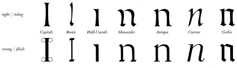 Wherever parallelism reigns in the thickness of the stems of the lettering, the artistic element is already spoiled in the individual form. The above illustration shows this plainly.
The stiff handling of the scribe’s pen cannot embody the artistic ideal in lettering, because, if it were so, the forced soldier-like standing-to attention would give the same high artistic enjoyment as the free rhythmical dance movement.
Walter Kaech, Rhythm And Proportion In Lettering [Rhythmus Und Proportion In Der Schrift] Olten Und Freiburg Im Breisgau : Walter-Verlag. Copyright Otto Walter Ltd., Olten (Schweiz), 1956.
Wherever parallelism reigns in the thickness of the stems of the lettering, the artistic element is already spoiled in the individual form. The above illustration shows this plainly.
The stiff handling of the scribe’s pen cannot embody the artistic ideal in lettering, because, if it were so, the forced soldier-like standing-to attention would give the same high artistic enjoyment as the free rhythmical dance movement.
Walter Kaech, Rhythm And Proportion In Lettering [Rhythmus Und Proportion In Der Schrift] Olten Und Freiburg Im Breisgau : Walter-Verlag. Copyright Otto Walter Ltd., Olten (Schweiz), 1956.
|
|
![[Grand Lodge]](../../../images/hedn.jpg)