|
|
|
SOME HISTORICAL FACTS ABOUT THE ROMAN CAPITAL SCRIPT
Literature on the subject of historical development of lettering shows that the Roman Capital Scripts of the first century in their perfect beauty may be said to be the starting point of the European culture of lettering. The formal differences between the Capital Script of the beginning of the first century and those in use toward the end of that century are, however, unfortunately not mentioned in this literature. There are two varleties of the Capital Scripts carved in stone: the first is the "ductus quadratus", which had already at the beginning of the first century, at the time of Augustus, been fully developed as an ideal form. Towards the end of this century we find a second kind, the oblong form "ductus allungatus", which probably arose through the influence of the current hand of that time. (According to Dr. Onorato of Naples, the "ductus allungatus" is supposed to have arisen through the influence of the etrusco-italic script. There are indications that it would be worth while to go further with this theory.) Whilst the "ductus quadratus", partially changed, is still to be found in the second century, we find in the third century beside the carved Rustic Capitals only the "ductus allungatus".
Very beautiful old Capital Scripts are to be found in the museums of Bologna, Ferrara, Rimini, Pesaro and Verona (the Adriatic Etruscan zone). They can be traced back to the epochs of Augustus, Tiberius, Claudius and Nero. We are able to fix the age of the Roman Capital Script by the text and the so-called »SEVIRO-Signs«, which are to be found here and there on tombstones. The deceased persons indicated as  VIR followed in their lifetimes the cult of their respective Emperors. In the reigns of Augustus (30 B.C. - 12 A.D.), Tiberius (14 - 37 A.D.), Claudius (41 - 54 A D.) and Nero (54 - 68 A.D.), the SEVIRI had a half secular and half priestly function. It was their duty to organise festivals, games, spectacles, banquets and sacrificial fcasts. Together with the name of the deceased the inscriptions on the tombstones carry the subtitle VIR AVGVSTALIS, VIR TIBERIANVS, VIR CLAVDIALIS, or VIR NERONIENSIS, which denotes the respective epoch. In varlous inscriptions which belong to the named period of time, the original sign VIR is represented by the Roman numerals, for example VI VIR. In the time of the Flavian Emperors (69-96 A.D.) we no longer meet with the above mentioned cult, and the mentioned signs are no more to be found on the tombstones of the last third of the first century.
From the beginning of the first century the form of the Capital Script still shows signs of the written model, so that it is beyond all doubt that the carved inscription was sketched on stone with a flat brush. A comparison of these earlier forms with those of the second century, so far as aesthetic effect is concerned, is favourable to the form of the first century. The terminals in this original form are carried out logically on the baseline and headline as we can see in a proportionally and rhythmically settled way. The little terminal serifs in the rounded forms C, G and S are to be found at the same height as the serifs of the straight forms E, F, L and T. This means that the inner spaces of the letters are fully preserved and that the aspect of the line is one of monumental calm. The first oblique stroke in the V shows no serif, which is drawn inwards, but serves as a beginning like the beginnings effect of the individual letters and with it also the written model of the script. The reproductions which look darker are from inscriptions carved in sandstone. These are the earlier forms, which come from the museums of the towns already mentioned. The reproductions which look lighter are from inscriptions in marble, most of which come from the National Museum in Naples and they show somewhat later forms, influenced in part by "ductus allungatus" and the Rustic Capitals.
In order to give the largest reproductions possible of the impressive forms of the letters, we have dispensed with reproducing the texts complete. The reproductions are about two-thirds the original size.
[pages 40 to 61 omitted and represented by page 39] VIR followed in their lifetimes the cult of their respective Emperors. In the reigns of Augustus (30 B.C. - 12 A.D.), Tiberius (14 - 37 A.D.), Claudius (41 - 54 A D.) and Nero (54 - 68 A.D.), the SEVIRI had a half secular and half priestly function. It was their duty to organise festivals, games, spectacles, banquets and sacrificial fcasts. Together with the name of the deceased the inscriptions on the tombstones carry the subtitle VIR AVGVSTALIS, VIR TIBERIANVS, VIR CLAVDIALIS, or VIR NERONIENSIS, which denotes the respective epoch. In varlous inscriptions which belong to the named period of time, the original sign VIR is represented by the Roman numerals, for example VI VIR. In the time of the Flavian Emperors (69-96 A.D.) we no longer meet with the above mentioned cult, and the mentioned signs are no more to be found on the tombstones of the last third of the first century.
From the beginning of the first century the form of the Capital Script still shows signs of the written model, so that it is beyond all doubt that the carved inscription was sketched on stone with a flat brush. A comparison of these earlier forms with those of the second century, so far as aesthetic effect is concerned, is favourable to the form of the first century. The terminals in this original form are carried out logically on the baseline and headline as we can see in a proportionally and rhythmically settled way. The little terminal serifs in the rounded forms C, G and S are to be found at the same height as the serifs of the straight forms E, F, L and T. This means that the inner spaces of the letters are fully preserved and that the aspect of the line is one of monumental calm. The first oblique stroke in the V shows no serif, which is drawn inwards, but serves as a beginning like the beginnings effect of the individual letters and with it also the written model of the script. The reproductions which look darker are from inscriptions carved in sandstone. These are the earlier forms, which come from the museums of the towns already mentioned. The reproductions which look lighter are from inscriptions in marble, most of which come from the National Museum in Naples and they show somewhat later forms, influenced in part by "ductus allungatus" and the Rustic Capitals.
In order to give the largest reproductions possible of the impressive forms of the letters, we have dispensed with reproducing the texts complete. The reproductions are about two-thirds the original size.
[pages 40 to 61 omitted and represented by page 39]
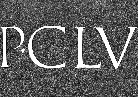 1) Museo Santo Stefano, Bologna (erected 20 A.D. / 20 n. Chr.) augustea-prima
Walter Kaech, Rhythm And Proportion In Lettering [Rhythmus Und Proportion In Der Schrift] Olten Und Freiburg Im Breisgau : Walter-Verlag. Copyright Otto Walter Ltd., Olten (Schweiz), 1956.
1) Museo Santo Stefano, Bologna (erected 20 A.D. / 20 n. Chr.) augustea-prima
Walter Kaech, Rhythm And Proportion In Lettering [Rhythmus Und Proportion In Der Schrift] Olten Und Freiburg Im Breisgau : Walter-Verlag. Copyright Otto Walter Ltd., Olten (Schweiz), 1956.
|
|
![[Grand Lodge]](../../../images/hedn.jpg)