|
|
|
PEN POSITION AND THE SHAPING OF SPACE AS PROPORTION
The cultural value of each letter form depends upon the pen with the broad nib. Writing tools which always produce the same thickness of strokes in every direction are therefore unsuitable because they exclude the rhythmical contrast between the thin upstroke and the thick downstroke, between pressure and release of pressure.
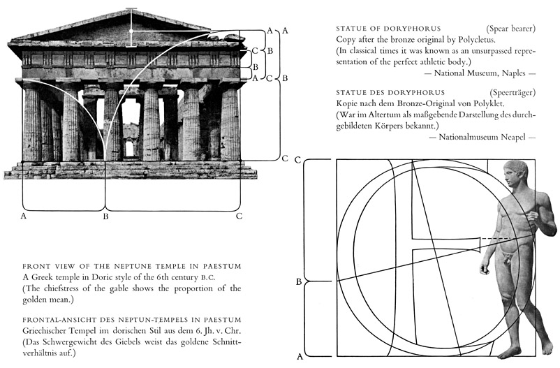
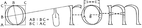
The chief contrasting movements take place in the x-height area between the baseline and the waist-line; the ascenders and descenders must be considered as secondary rhythmical phenomena in the texture of the line. According to the position in which the scribe holds the pen the boldness of the aspect of the lettering changes, in that the thin and thick values shift. We can call the pen position normal or harmonious when the proportion of the golden mean is found between the thickness of the vertical main pen strokes and the thickness of the horizontal strokes. How this proportion appears in the letter O is shown in the marginal illustration. This initial pen position. prevalent in most scripts, affects not only the rhythmical course of writing, but is further carried into the aspect of the word-picture itself. Thus in the balanced word-picture we notice that the inner spaces of the letters and the spaces between the letters reveal the proportion of the golden mean.
 The letter O should be considered as a basis for the width of all the other letters as well as for their inner spaces. The spacing within the framework of the line must be given the same consideration as the letterforms themselves, because form and counterform of written matter as well as the proportions of space within and between the letters give to the lettering the necessary tension on its rhythmical course. Whilst writing, we catch and arrange light within the lettering lines and the entire picture of the lettering. This enclosing and limiting, displacing and activating, which gives light within the line of lettering, is the result of rhythmical movement in harmonious proportion. By strengthening the beginnings and endings on the lower and upper terminals of the lettering the spaces of light are caught by the eye, also in the case of disconnected lettering, and thus at the same time the even texture of the line is emphasised.
In consequence, we recognise rhythm and proportion in lettering as two inseparable terms, because they interact upon each other. Rhythm and proportion together form the basis for the harmonious aspect of the page.
A stirring beauty radiates from the scripts of varlous epochs. The following forms, written as large as possible, give us the effect of movement in different rhythmical variants. [Pages 25-28, 30-32 omitted]
The letter O should be considered as a basis for the width of all the other letters as well as for their inner spaces. The spacing within the framework of the line must be given the same consideration as the letterforms themselves, because form and counterform of written matter as well as the proportions of space within and between the letters give to the lettering the necessary tension on its rhythmical course. Whilst writing, we catch and arrange light within the lettering lines and the entire picture of the lettering. This enclosing and limiting, displacing and activating, which gives light within the line of lettering, is the result of rhythmical movement in harmonious proportion. By strengthening the beginnings and endings on the lower and upper terminals of the lettering the spaces of light are caught by the eye, also in the case of disconnected lettering, and thus at the same time the even texture of the line is emphasised.
In consequence, we recognise rhythm and proportion in lettering as two inseparable terms, because they interact upon each other. Rhythm and proportion together form the basis for the harmonious aspect of the page.
A stirring beauty radiates from the scripts of varlous epochs. The following forms, written as large as possible, give us the effect of movement in different rhythmical variants. [Pages 25-28, 30-32 omitted]
 Walter Kaech, Rhythm And Proportion In Lettering [Rhythmus Und Proportion In Der Schrift] Olten Und Freiburg Im Breisgau : Walter-Verlag. Copyright Otto Walter Ltd., Olten (Schweiz), 1956.
|
|
![[Grand Lodge]](../../../images/hedn.jpg)