|
|
|
THE PROPORTION OF THE GOLDEN MEAN IN THE CAPITAL SCRIPT
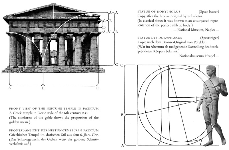
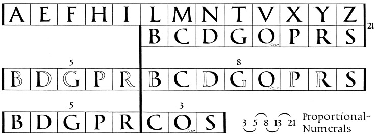
The preceding chapters give us an indication as to how we are to look at Roman Capitals. Not in the light of the beginnings of technical drawing of the 16th century, but in the light of the traditional culture of the Greeks and Etruscans, which was still alive in the art of the first century, can we see the way to approach the harmonious forms of the Roman Capital Script. Whether we start with the proportions of the ideal Greek human body, or with the harmonious pen position taken by the hand (see page 23), we can arrive at a valid result only if at the same time we consider rhythmical relations. The interrelations between rhythm and proportion are many, and thus the rhythmical termination of the script at the height of the baseline suggests that the proportion of the golden mean was already embodied in the Roman alphabet.
From the illustration on the next page it is possible to deduce the following three definitions based on the old proportional numerals:
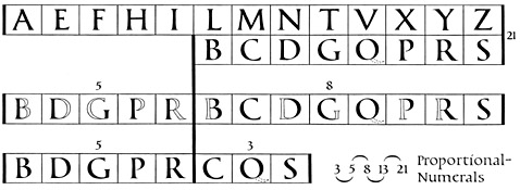 The sum of the round letters is in the same proportion to the sum of the straight letters as is the sum of the straight letters to the sum of the whole alphabet (8 : 13 = 13 : 21).
The sum of the straight elements within the round letters is in the same proportion to the sum of the round letters as the sum of the round letters is to the surn of the straight letters (5 : 8 = 8 : 13).
The sum of the entirely round letters is in the same proportion to the sum of the partly-round letters as is the sum of the partly-round letters to the sum of all the round letters (3 : 5 = 5 : 8).
This representation of proportion in the Capital Script was a logical elaboration in maintaining the aspect of the lettering. Observations of this script show in excellent examples the proportion of the golden mean between the height of the top line of lettering and the height of the following smaller lines. The same thing may also be observed between the height of the letters and the height of the line space. In the Capital Script, the height of the letters decreases towards the bottom of the inscription, and this has nothing to do with any lack of space. Empty spaces below the inscriptions which frequently are in the proportion of the golden mean to the whole area of the lettering, confirm on the contrary the assumption, that the creation of the lettering of the period represented a deliberate consequence of these relations of proportions (see Illustration page 66 and rubbings XI and XII). Drawing a conclusion from these relations it is correct to observe the individual letters as a representation of proportion.
The Representation of the Alphabet
The presentation of the whole alphabet springs from the position of the pen which divides the four sides of the square into its main proportions (see also page 23). The proportions of space as well as of mass, must be taken into account in determining the width of the individual letters in relation to each other. The inner spaces of the letter O which is related to the width of most letters, and additional smaller proportions of the golden mean which branch off from the main proportion, give us the desired measurements. In the skeleton outline constructed for greater clearness, these separations are marked by brackets to show how they form among themselves the proportion of the golden mean. Starting from the height of the letter we may consider the 5th measurement of division as the thickness of the main stem. At any rate we must adhere to this value or to something near it, when choosing the thickness of the script, as otherwise the inner spaces of the letters go wrong. The importance of the proportional number 5 in the general composition is already evident from the number of vowels contained in the alphabet (A, E, I, 0, U).
The direct revaluation of the aforementioned proportional numbers with the values measured by the yardstick will not yield an artistic result. Taken as a measurement the ratio 34: 55 gives us the proportion of the golden mean. This numerical series below this proportion give us the golden mean inaccurately. The same holds good when we construct the proportion of the golden mean geometrically. In this case the sum of the measurements of the subdivisions no longer give the measure of the previous first constructional representation. These facts show quite clearly that the proportional measurements traced with the compass have to be fixed entirely intuitively (with the eye). The proportion of the golden mean as a law of nature applies therefore to what I said before on page 12 "the rhythmical course of things is of an optical and not of a mathematical kind". The values of proportions fixed by the eye make individual achievements in the creation of lettering possible.
The letters K, U and W are to be regarded as newly added forms to the Roman alphabet. At the same time a somewhat narrower variant of the letter R is presented which harmonises with the letter K. The proportion of inner space, as indicated in the form for the double T applies also to the double L.
All the illustrated letters of the Roman Capital script were written with the broad pen with free rhythmical movements between the fixed points of proportion analagous to the original model.
Walter Kaech, Rhythm And Proportion In Lettering [Rhythmus Und Proportion In Der Schrift] Olten Und Freiburg Im Breisgau : Walter-Verlag. Copyright Otto Walter Ltd., Olten (Schweiz), 1956.
The sum of the round letters is in the same proportion to the sum of the straight letters as is the sum of the straight letters to the sum of the whole alphabet (8 : 13 = 13 : 21).
The sum of the straight elements within the round letters is in the same proportion to the sum of the round letters as the sum of the round letters is to the surn of the straight letters (5 : 8 = 8 : 13).
The sum of the entirely round letters is in the same proportion to the sum of the partly-round letters as is the sum of the partly-round letters to the sum of all the round letters (3 : 5 = 5 : 8).
This representation of proportion in the Capital Script was a logical elaboration in maintaining the aspect of the lettering. Observations of this script show in excellent examples the proportion of the golden mean between the height of the top line of lettering and the height of the following smaller lines. The same thing may also be observed between the height of the letters and the height of the line space. In the Capital Script, the height of the letters decreases towards the bottom of the inscription, and this has nothing to do with any lack of space. Empty spaces below the inscriptions which frequently are in the proportion of the golden mean to the whole area of the lettering, confirm on the contrary the assumption, that the creation of the lettering of the period represented a deliberate consequence of these relations of proportions (see Illustration page 66 and rubbings XI and XII). Drawing a conclusion from these relations it is correct to observe the individual letters as a representation of proportion.
The Representation of the Alphabet
The presentation of the whole alphabet springs from the position of the pen which divides the four sides of the square into its main proportions (see also page 23). The proportions of space as well as of mass, must be taken into account in determining the width of the individual letters in relation to each other. The inner spaces of the letter O which is related to the width of most letters, and additional smaller proportions of the golden mean which branch off from the main proportion, give us the desired measurements. In the skeleton outline constructed for greater clearness, these separations are marked by brackets to show how they form among themselves the proportion of the golden mean. Starting from the height of the letter we may consider the 5th measurement of division as the thickness of the main stem. At any rate we must adhere to this value or to something near it, when choosing the thickness of the script, as otherwise the inner spaces of the letters go wrong. The importance of the proportional number 5 in the general composition is already evident from the number of vowels contained in the alphabet (A, E, I, 0, U).
The direct revaluation of the aforementioned proportional numbers with the values measured by the yardstick will not yield an artistic result. Taken as a measurement the ratio 34: 55 gives us the proportion of the golden mean. This numerical series below this proportion give us the golden mean inaccurately. The same holds good when we construct the proportion of the golden mean geometrically. In this case the sum of the measurements of the subdivisions no longer give the measure of the previous first constructional representation. These facts show quite clearly that the proportional measurements traced with the compass have to be fixed entirely intuitively (with the eye). The proportion of the golden mean as a law of nature applies therefore to what I said before on page 12 "the rhythmical course of things is of an optical and not of a mathematical kind". The values of proportions fixed by the eye make individual achievements in the creation of lettering possible.
The letters K, U and W are to be regarded as newly added forms to the Roman alphabet. At the same time a somewhat narrower variant of the letter R is presented which harmonises with the letter K. The proportion of inner space, as indicated in the form for the double T applies also to the double L.
All the illustrated letters of the Roman Capital script were written with the broad pen with free rhythmical movements between the fixed points of proportion analagous to the original model.
Walter Kaech, Rhythm And Proportion In Lettering [Rhythmus Und Proportion In Der Schrift] Olten Und Freiburg Im Breisgau : Walter-Verlag. Copyright Otto Walter Ltd., Olten (Schweiz), 1956.
|
|
![[Grand Lodge]](../../../images/hedn.jpg)